NAV ADHD Coaching Website
Neurodivergent-friendly coaching platform with resources and community
The Problem
ADHD coaching websites are often cluttered, overwhelming, and ironically not designed for ADHD brains. Neurodivergent visitors struggle with busy layouts, hidden information, and confusing navigation.
Specific Pain Points
- Visual overload: Too many colors, fonts, and competing elements create sensory overwhelm
- Hidden information: Key details (pricing, booking, resources) buried in complex menus
- Confusing navigation: ADHD users need clear, simple paths to what they're looking for
- Not mobile-friendly: Many users browse on phones while multitasking
The Solution
Full-featured ADHD coaching platform with resources, community features, and booking. Designed with neurodivergent-friendly UX principles and accessibility in mind.
Key Features
Clean, Calm Design
Minimal layout with soft colors and plenty of whitespace
Clear Navigation
Straightforward menu with obvious labels—no guessing
Resource Library
Free ADHD resources organized by topic with visual categories
Easy Booking
Integrated scheduling system with clear pricing and availability
Mobile-First
Fully responsive design that works seamlessly on any device
Accessibility
Keyboard navigation, screen reader support, high contrast mode
Design Showcase
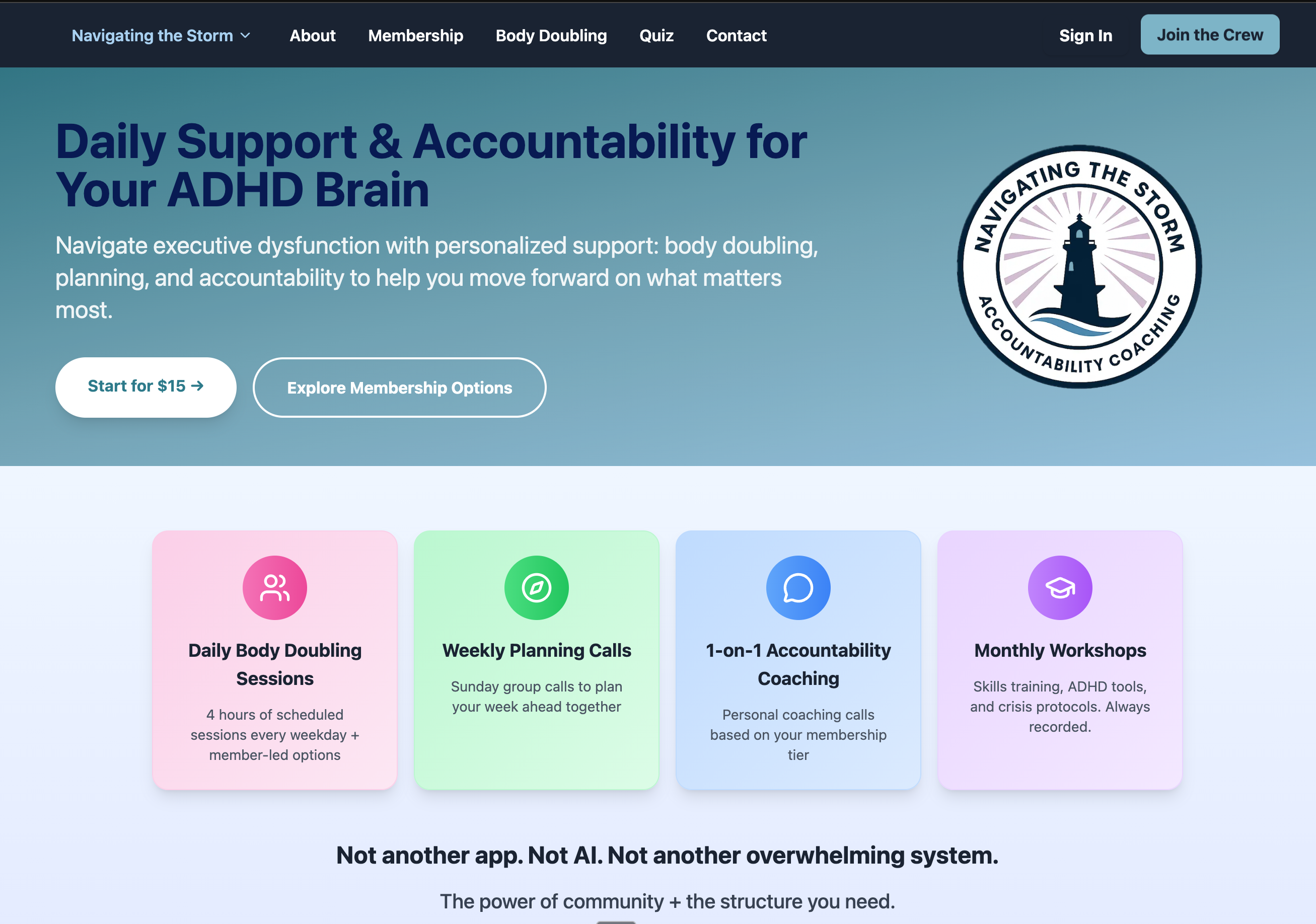
Homepage with neurodivergent-friendly design and clear navigation
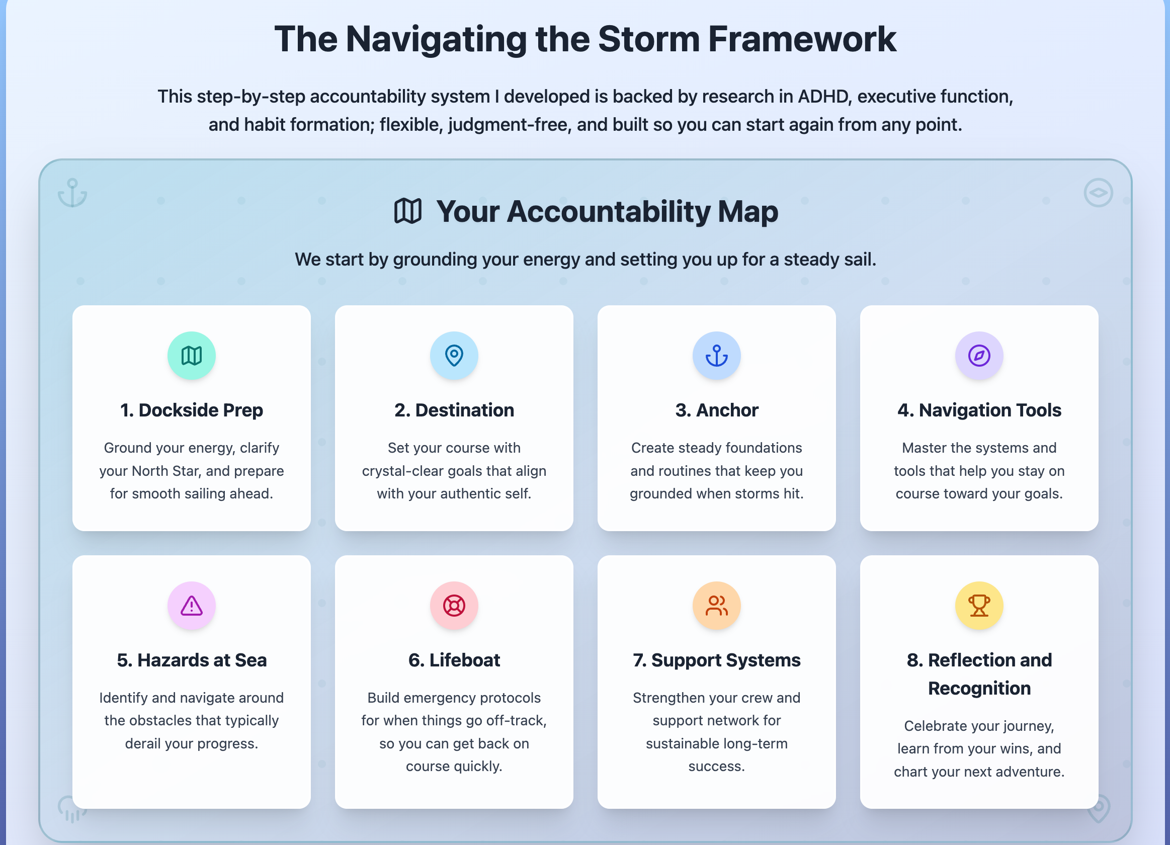
Resource library with organized content and accessibility features
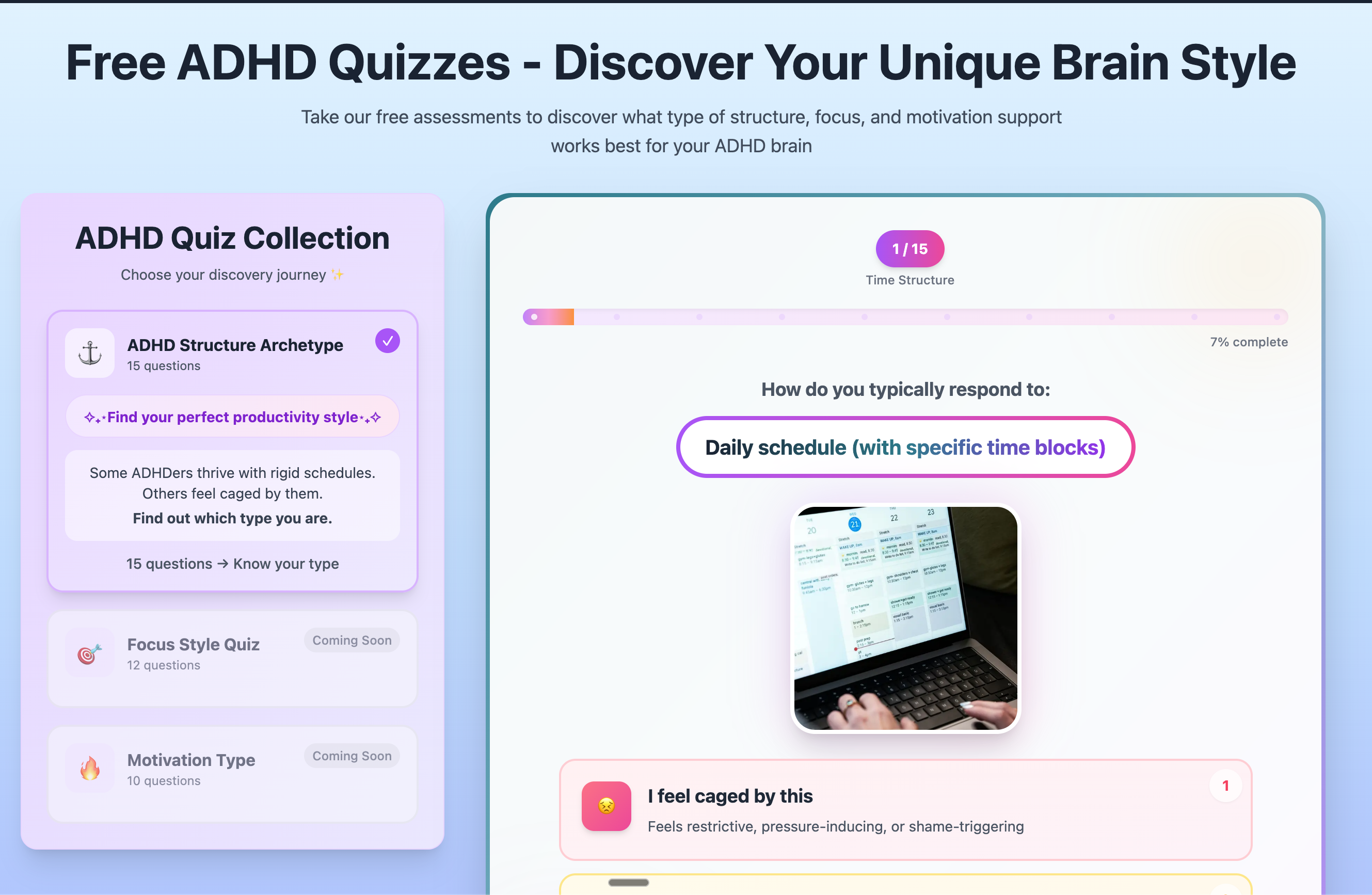
Coaching features and booking interface
Design Principles
Neurodivergent-Friendly UX
Every design decision was made with ADHD users in mind:
Reduce Cognitive Load
One clear action per section. No competing CTAs or hidden features.
Calm Visual Design
Soft colors, generous whitespace, and minimal animations to prevent sensory overwhelm.
Clear Information Hierarchy
Important information (pricing, booking) upfront—no searching through menus.
Mobile-First Approach
ADHD users often multitask on phones. The site works perfectly on any screen size.
Results & Impact
Lessons Learned
Design for your user, not yourself
I had to resist adding "cool" features that would distract from the core purpose. Simplicity is hard but necessary.
Accessibility benefits everyone
Features built for ADHD users (clear navigation, reduced clutter) make the site better for all visitors.